casita travel trailers
Brand design, web design, and marketing assets
Role in project solo designer, partnering with We Are Unicorns
Casita makes some of the best travel trailers on the market: lightweight, compact, and low maintenance, the brand has been a staple at campgrounds across the country for over 50 years.
Casita was ready to update their previously dated brand with the hopes of getting in front of new customers and becoming the standard for the fiberglass travel trailer industry.
purpose
After the team worked to establish Casita’s target audience and vision for the future of the brand, I got to work bringing these concepts to life. The idea was to update the logo and make it look more modern and easier to read. At the same time though, the brand wanted to stay recognizable to their current audience.
When creating the visual brand we were focusing on 35+ year old nature lovers who live in metropolitan areas, and I crafted all design decisions around this ideal customer profile.
For additional brand assets, Casita was previous using a palette of blues. I planned to expand this palette to additional colors, and then stretched across a website design, social posts, and misc marketing material.
concept
I started by finding a font that had a casual, outdoorsy, and retro feel – but was in the same ballpark as their current logo in order to not alienate current customers familiar with the brand. Once settling on a font, I went in and made customized modifications to make it better fit the concept and allow it to be unique to Casita.
When the logo mark was in place, we began building out a color palette. We stuck with a brightened version of their classic blue, and built an extended palette that introduced yellow and some bolder blue colors.
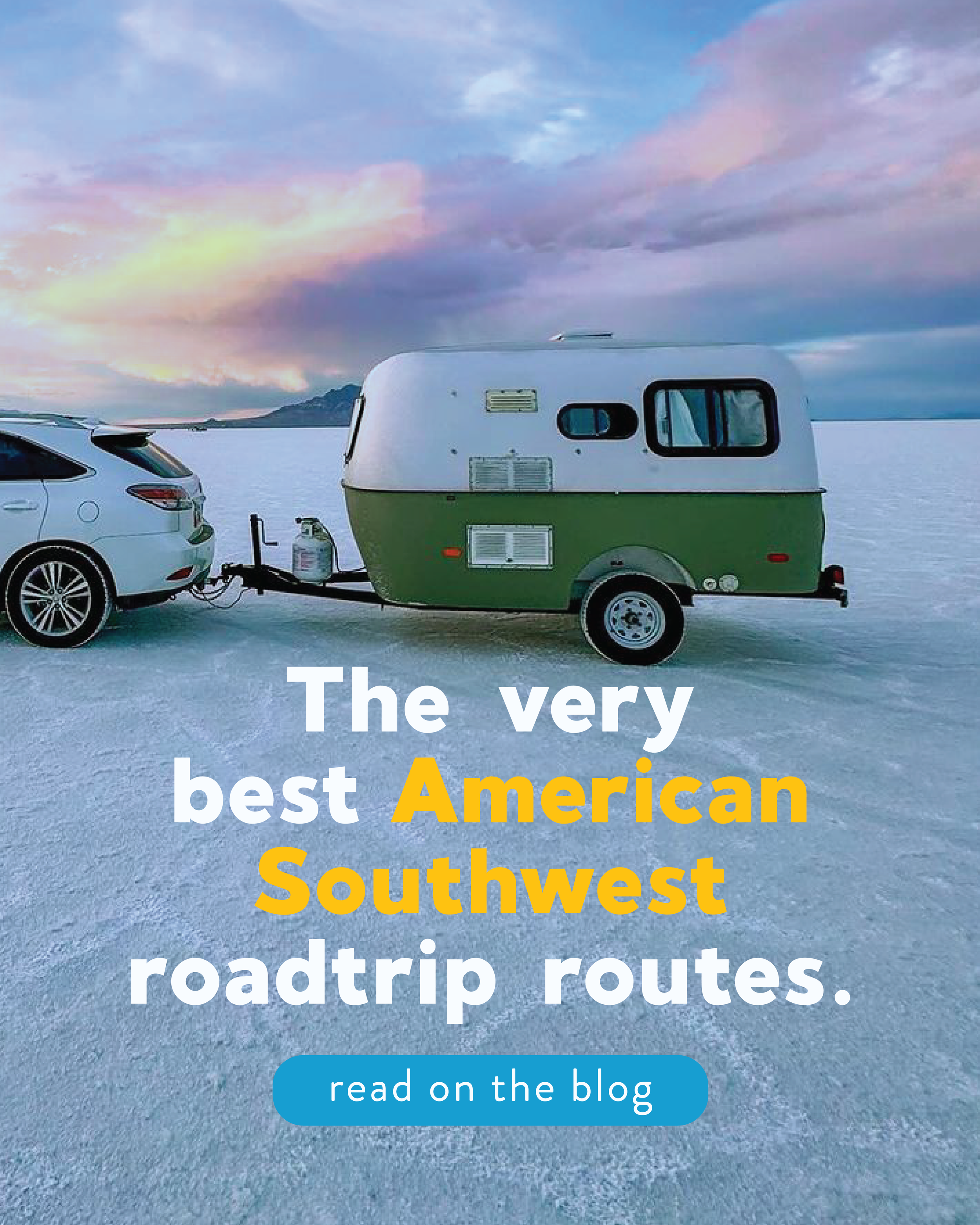
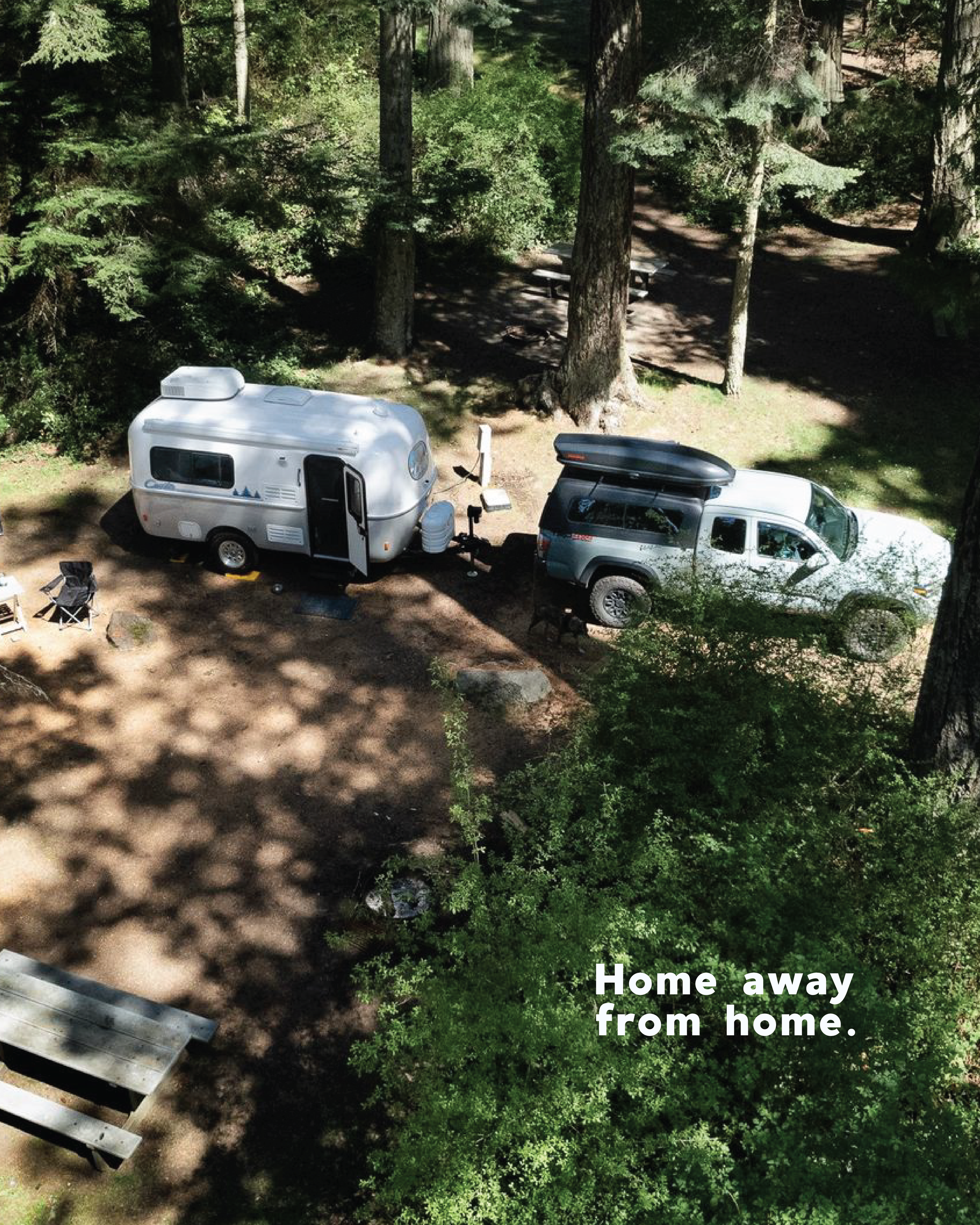
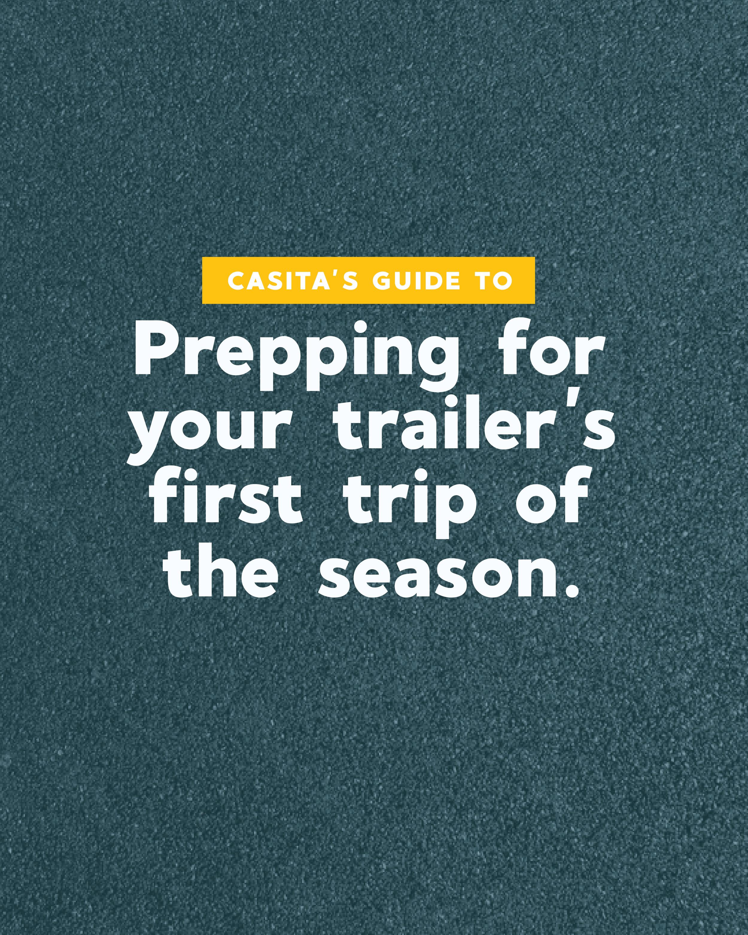
With these key elements in place, I began stretching these elements into a website design, social posts, and misc signage.
solution


let’s make
things official
Ready to get started?


